The king of cryptocurrencies has not always had this shape or this orange color. Let’s revisit the remarkable history of the most famous logo in Crypto.
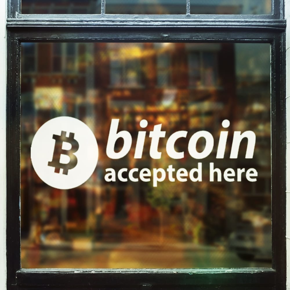
We find it on thousands of store windows around the world, on t-shirts, and even emblazoned on buses, the Bitcoin logo has become a brand with a true identity, which has been shaped since its creation.
But who actually created the famous Bitcoin logo?
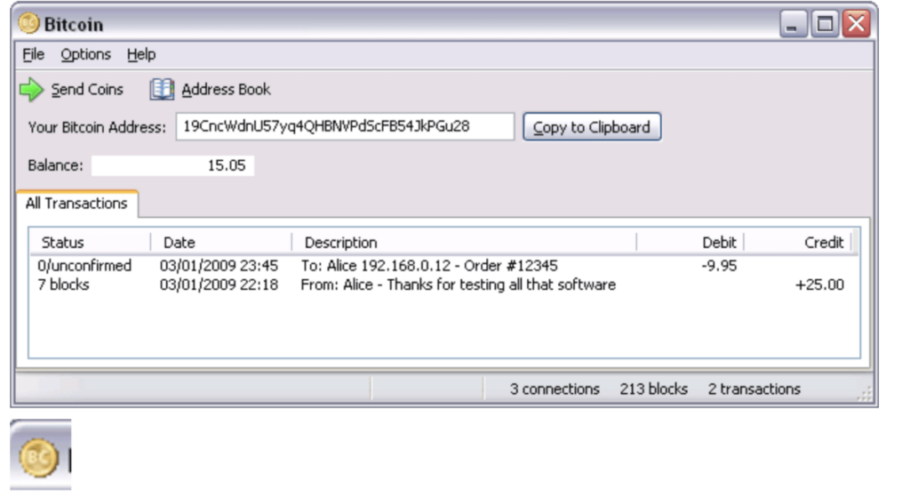
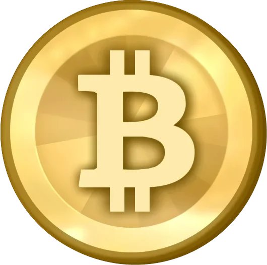
Let’s travel back to 2009, Satoshi had just created Bitcoin. From the beginning, he immediately thought about giving his crypto a logo. He wanted to involve the community right away and initially presented them with a rather minimalist design: a gold coin engraved with the letters “BC.”

While this design could refer to Bitcoin as “digital gold,” Satoshi never really spoke about the actual meaning of the logo he created. However, users of the legendary forum “BitcoinTalk” seem really divided on the concept of the logo, with some asserting that adopting a logo is completely unnecessary and contrary to the spirit of cryptocurrency.
Giving Bitcoin a logo, for some, feels too much like a move towards centralization. However, Satoshi didn’t see it that way and updated the design of his logo a year later, in February 2010. He dropped the “BC” in favor of the simple “B” with vertical stripes ₿.
Better received than the first version, Satoshi’s design was still criticized by part of the community because it looked too much like the Thai Baht ฿, although it only has one vertical stripe.

Hal Finney immediately noted that: “Interestingly, the dollar sign was originally created with two vertical bars rather than one”.

Based on community feedback, Satoshi then incorporated changes into the new logo and released the royalty-free images into the public domain. The logo was then accepted as the official Bitcoin logo for a short period.
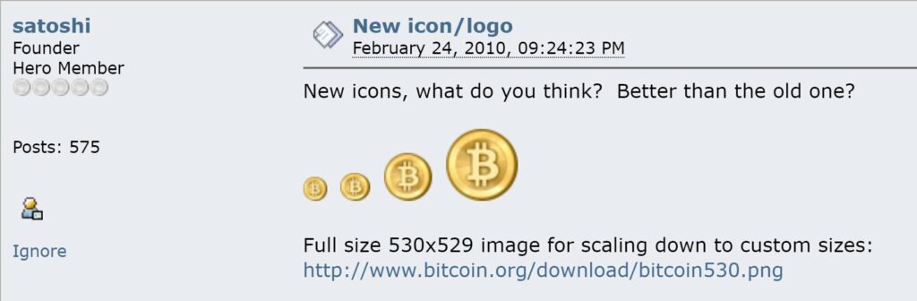
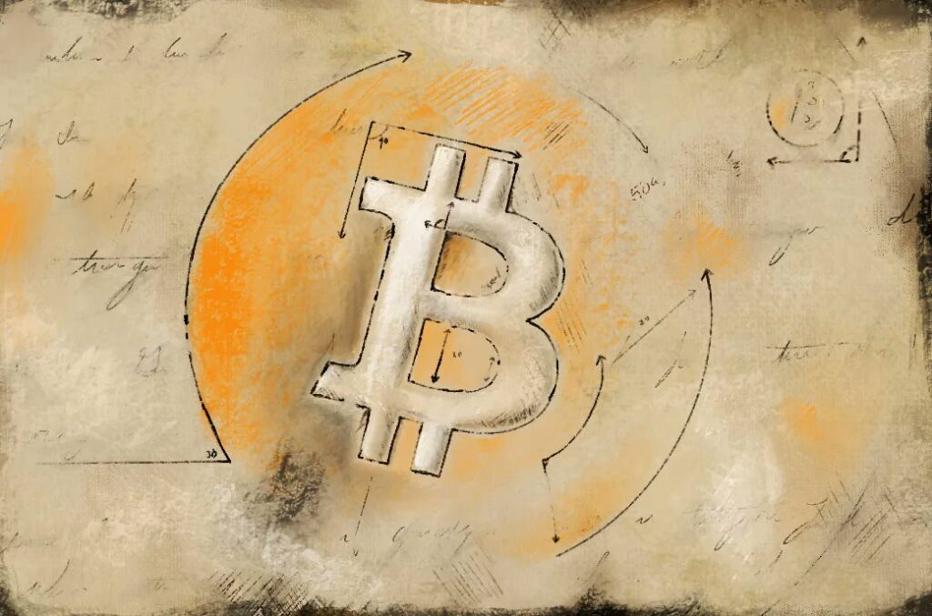
Indeed, it was on November 1, 2010, that the Bitcoin logo evolved into what we know today, driven by Bitboy, a member of the Bitcoin community. He slightly rotated the letter to tilt it and surrounded it with a bright, vibrant orange.

After releasing the finalized version of the Bitcoin logo, bitboy stated, “From now on, everyone can use the graphics freely, even for commercial purposes, with this license and without any restrictions”.

Paradoxically, bitboy was inspired by some of the companies that Bitcoin hopes to overturn. When another Bitcoin Talk user commented that the designs resembled the Mastercard logo, bitboy replied, “That’s the inspiration. The irony is that even though I hate [Mastercard] and [Visa], it’s all about perception when it comes to trust and consumer behavior. Lol”.
Yet, not everyone agrees with this Bitcoin logo, and some, like those behind bitcoinsymbol.org, have been campaigning since 2014 to change it. In fact, they do not want Bitcoin to have anything to do with a marketing logo.
“Currencies are represented by symbols like $, €, or ¥, aimed to be used everywhere by everyone.” As such, the group has advocated for the adoption of the Ƀ, which is a letter in several alphabets including Latin and several languages in Vietnam.
Many community members continue to post new logos for Bitcoin to this day, but so far none have managed to dethrone the current logo. Bitboy’s logo seems today accepted by a good part of the community as the sole and unique logo of Bitcoin.
Related Posts

Argus Labs: The Crypto Project Aiming to Revolutionize the Gaming Era with the World Engine

The Incredible Story of SlumDOGE MILLIONNAIRE